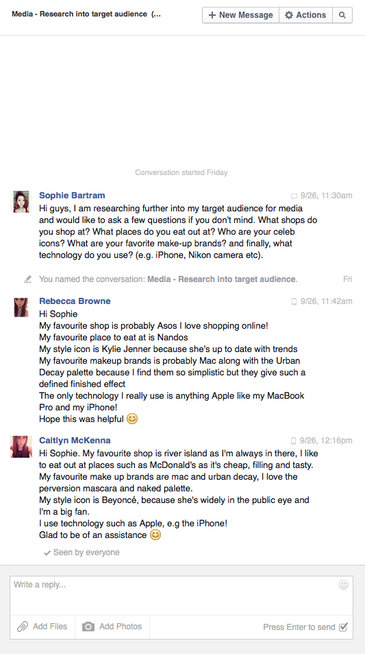
I got involved in places where my desired target audience would associate with to find out if they'd be interested in a fashion genre regional magazine. I found out that the majority of people who would be interested in this genre of magazine were around 17 years old. This would mean my primary audience is targeted at young adults, perhaps from 15-20 years old. I texted a handful of people from my contact list and asked them if they would be interested in this type of magazine. Their responses were very positive and they all said that they would be interested and that there is plenty of room for a regional magazine of this genre.
Sunday, 29 June 2014
Thursday, 26 June 2014
Pitch: Costume ideas
Pitch: Make-up ideas
Tuesday, 24 June 2014
Proposal & Mood Board
My initial proposal is to create
The first four pages from an original regional magazine together with two of the following three options:
- A radio advertisement for the magazine;
- Two hyperlinked pages from the magazine's website;
- A billboard advertisement for the magazine.
From the three choices I have chosen to do the two hyperlinked pages from the magazine's website and a billboard advertisement for the magazine.
This mood board shows the genre in which I am going to follow throughout the making of my proposal. It also shows the fonts, colours and make-up styles I will be doing to create my chosen proposals. I have also showed before and after make-up photos and make-up do's and don'ts. This is because I will be doing this in my magazine. I have chosen to a fashion genre because as it appeals to me most, I'd be able to do it to my full potential and correctly.
Tuesday, 17 June 2014
AS Reflection


This is my music magazine from my AS coursework. From this work I can identify some strengths and weaknesses.
The strengths include:
- My magazine follows the same colour pallet and house style throughout which makes it possess a professional and original style. I also used the colour red and black on my images too i.e. her lipstick to follow the genre I based my magazine around which was 'indie-rock' and 'pop'.
- I used a range of fonts to give my magazine excitement, but to keep it looking professional I kept to a basic style of font and only used a range of 4 so it didn't look to overcrowded. I took the saying "Less is more" and applied it to my magazine to ensure it had a finished professional appeal.
- I used medium shots for the 3 pages of my magazine to follow a simple and elegant style. I also used medium shots so the audience could see the person's facial expressions clearly as I believe facial expressions are everything in trying to allure a person to my magazine. I ensured my model was smiling on the front cover so that it could give out a friendly vibe which would potentially attract a wider audience. On the contents page I placed my model laying down with a guitar in hand. This fits in with my genre of 'indie rock' because usually that kind of genre create their own music with different kind of instruments rather than computer edited. I made sure my model had quite a neutral face on the contents page so that it portrays what kind of music she makes and how music is close to her heart (hence the guitar being placed near her heart). Finally on the double page spread, I ensured my model did a neutral pose because the story on the right hand side is traumatic which matches her facial expressions. This is a strength because I can now apply this knowledge to future designing.
The negatives include:
- The layout of my front cover didn't turn out as professional as I hoped it would. I could've made the 'battle of the bands' box a little bigger, I could have filled the space in the top right hand corner better by perhaps spreading out the competition to make the space more filled. I also could've added more sell lines to make it more attractive and professional.
- On my contents page I could've heightened the range of my page numbers to over 100 as this is what professional magazines have. My magazine didn't look as professional as I didn't include a wider range of page numbers.
- I could have added more images in my magazine on the contents page that I took myself. This would have made my magazine look more professional and original. Adding a range of images could've given an insight to what some of the page numbers contain. However, I only added two images so there wasn't a large insight on what was included in my magazine.
Subscribe to:
Posts (Atom)


